Walmart Sales Dashbaord
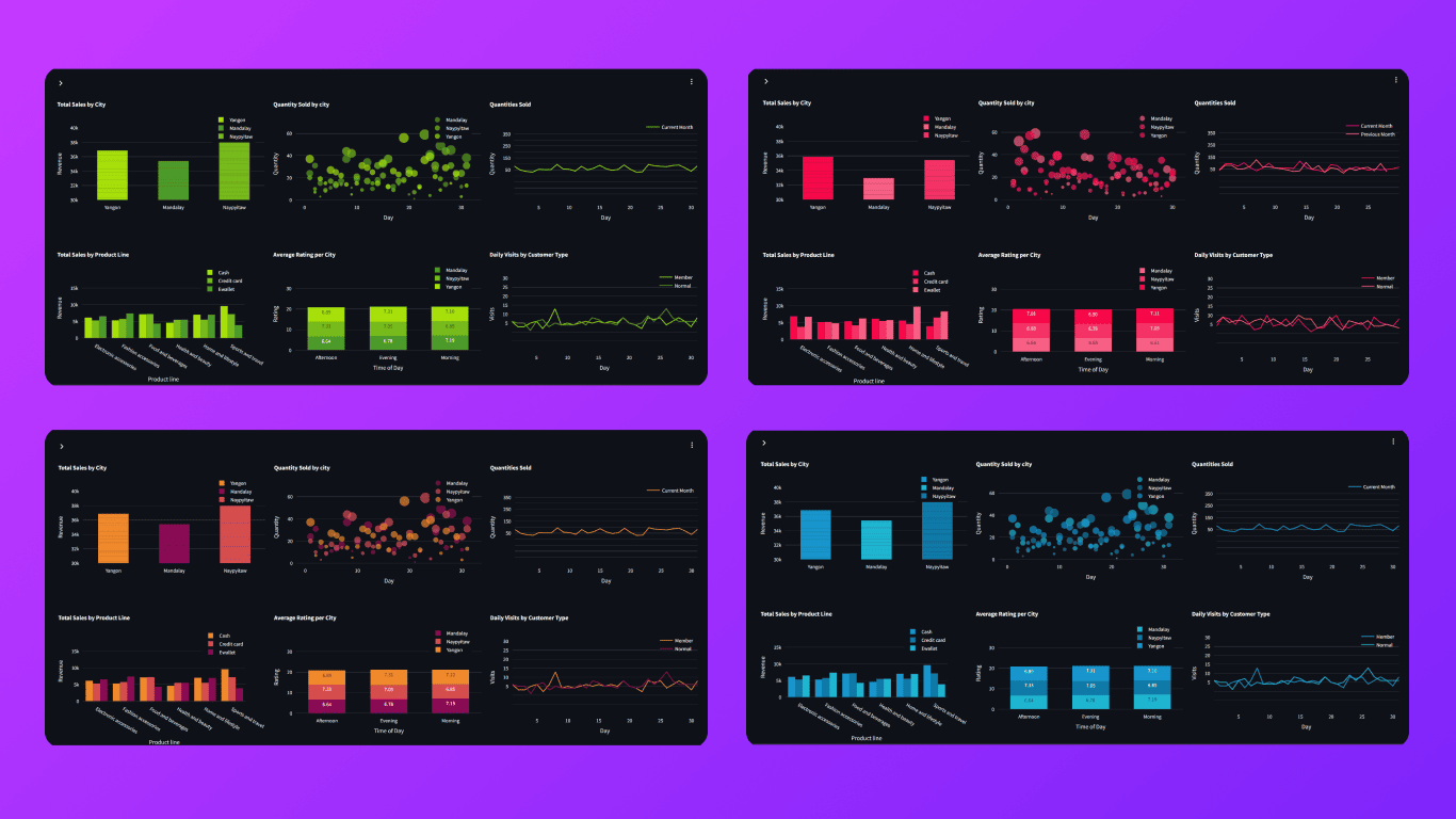
The Walmart Sales Dashboard is an interactive web-based application designed for visualizing sales data using Streamlit, Plotly, and Pandas. It provides users with insights into sales performance over different months, allowing for easy comparison and analysis.
Additionally, the dashboard leverages dynamic visualizations to highlight trends, distributions, and key metrics essential for data-driven decision-making.
Tech Stack:
Key Features:
-
Interactive Visualizations:
Utilize Plotly charts to present data in an engaging and informative way, enabling users to explore insights intuitively.
-
Month Selection:
Easily select the month for analysis, facilitating comparisons between different periods.
-
Theme Customization:
Choose from various color schemes to customize the dashboard's visual appearance.
-
Diverse Charts:
Includes various chart types for sales trends, comparative analysis, and category breakdowns.
-
Responsive Layout:
Designed for optimal viewing on various devices, enhancing accessibility for all users.
-
Documentation and Resources:
Integrated "About" section with links to the GitHub repository for source code access.